ČT24
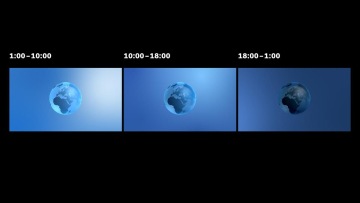
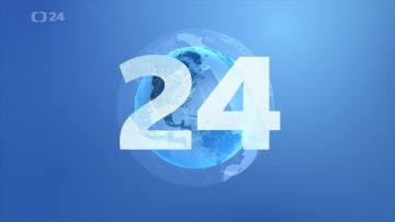
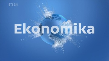
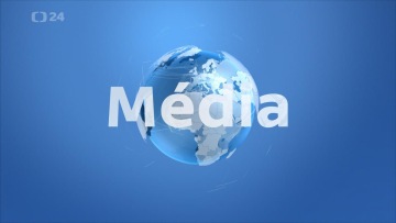
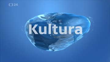
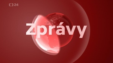
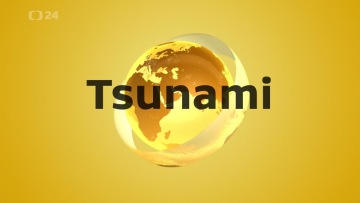
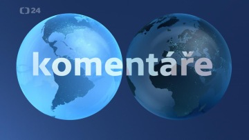
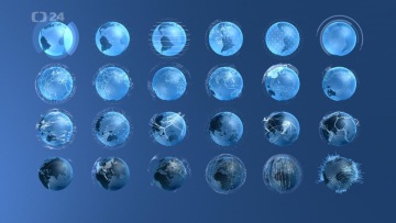
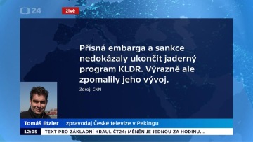
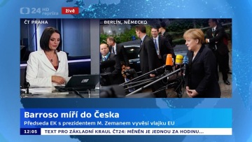
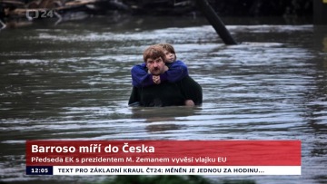
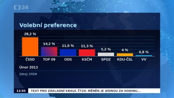
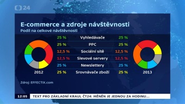
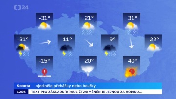
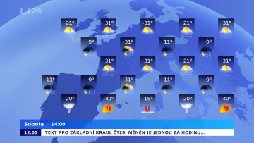
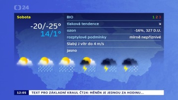
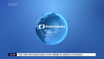
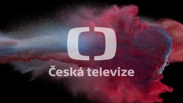
The redesign of the public news channel ČT24 significantly simplifies and streamlines its graphic system: one color, company font and a classic news globe unify everything from news ticker to features. Besides red news and yellow-black breaking news, the screen holds on to three shades of blue determined by the time of the day. The thematic focuses of the programs illustrate various "data spheres" enveloping the globe with real data about what is happening in the world (for weather - isobars, for sports – records in basic athletic disciplines, for media – satellite tracks and backbone data networks, etc. only arts & culture defy the basic shape). Compact modular structure of infographics with just four font sizes and a unifying underlying rectangle allows for each situation logically to layer elements on the screen, without the elements competing and losing clear hierarchy.
Client: Česká televize,
Designer: Martin Hejl, Daniel Špaček (Loom on the Moon), Petr Štěpán
Typography: Marek Pistora
Cooperation: Karel Havlíček (music), Tomáš Luňák (film director)
Font: TV Sans,
Type: Brand,
Year: 2014
