Bomma
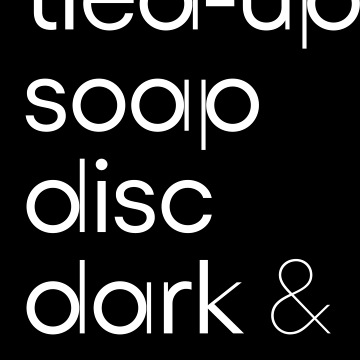
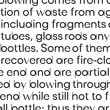
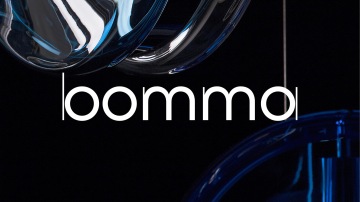
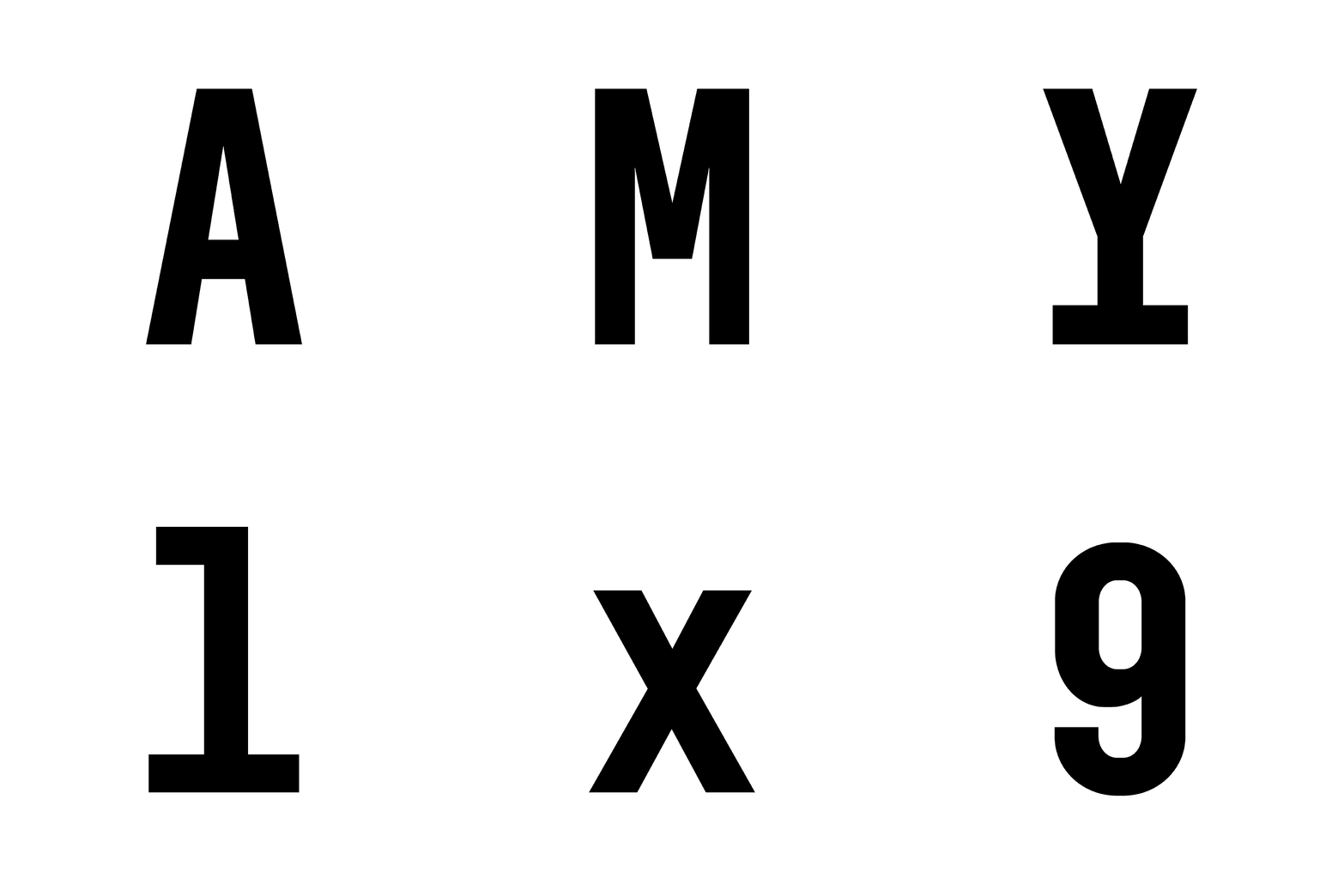
At the beginning of the development of the new brand for the modern glass company Bomma, the idea was to represent the minus sign "b" with only elementary shapes. Some people see them as a glass blowing rod with blown glass by its side, a shapeless lump of glass that transforms into a design with a breath. The contrast between the thin line and the fatter circle and the tension that arises where the two shapes almost touch refers to the fragility of glass products, especially the technologically extraordinary, large round chandeliers from Světlá nad Sázavou. It arbitrarily denies the typographic conventions of the entire alphabet, which was created on the basis of these assumptions.
Number of cuts:
8
Number of characters in the cut:
924


