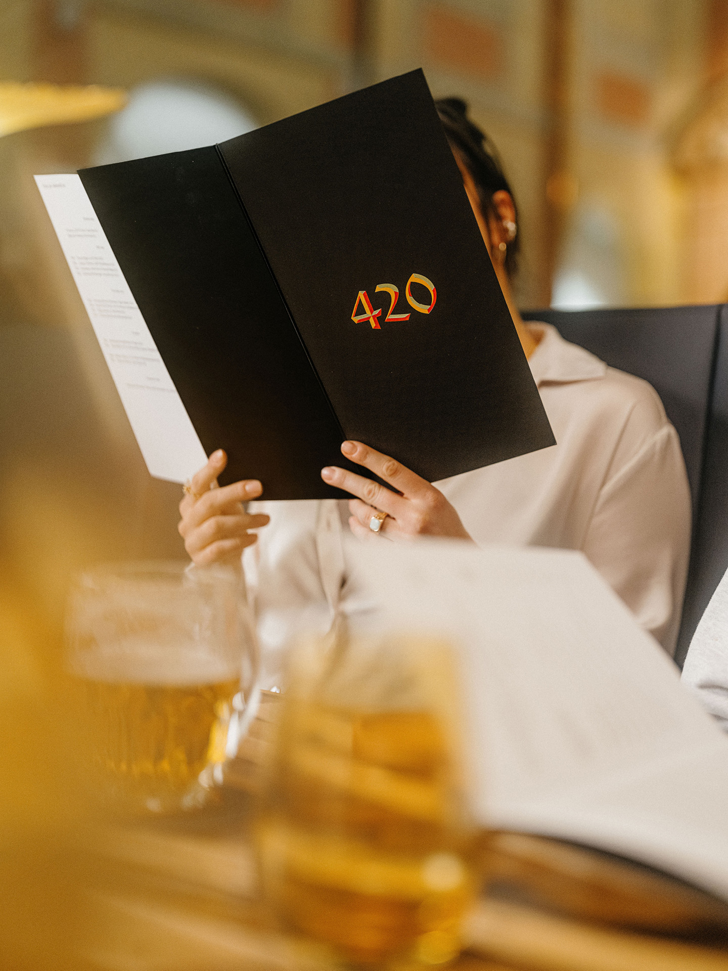
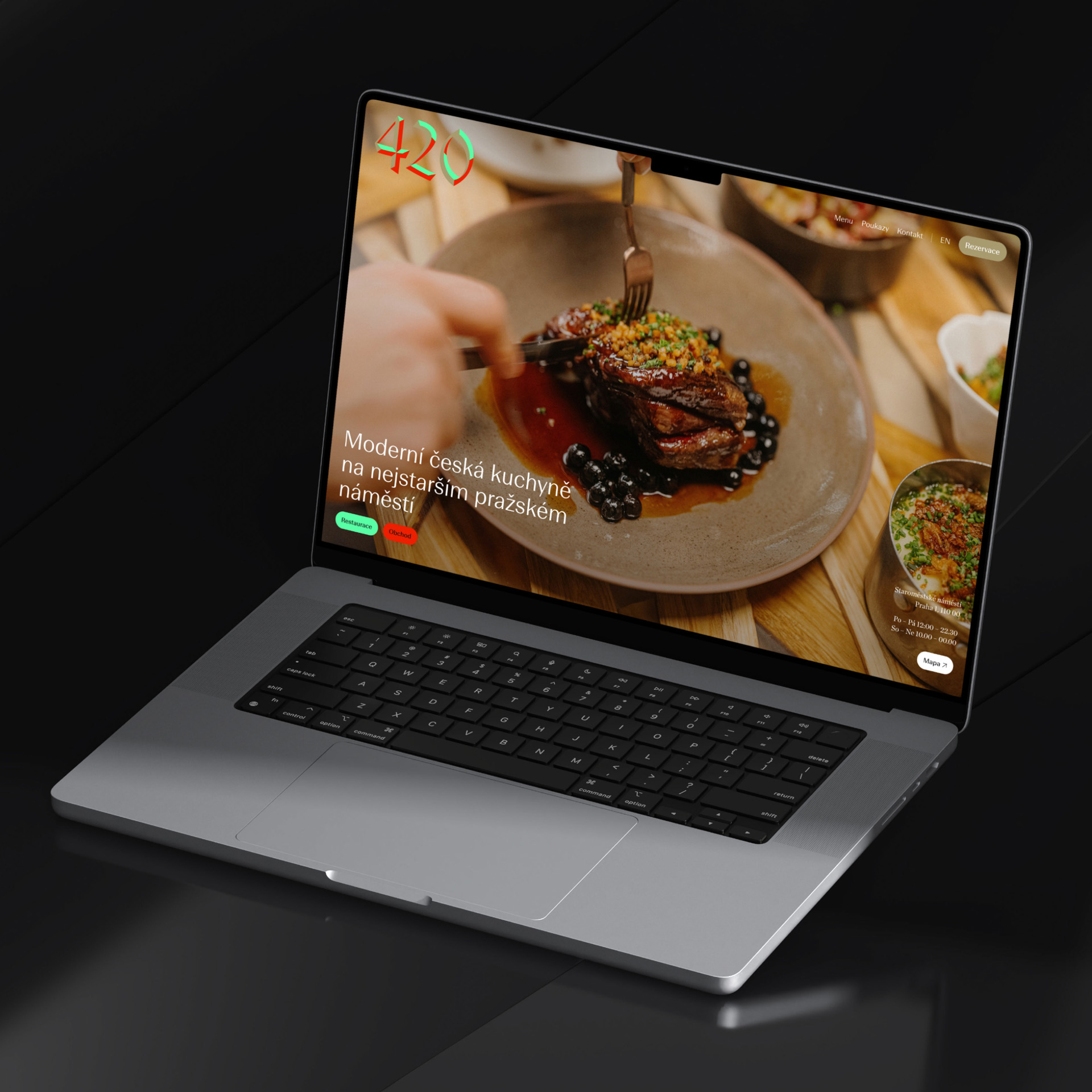
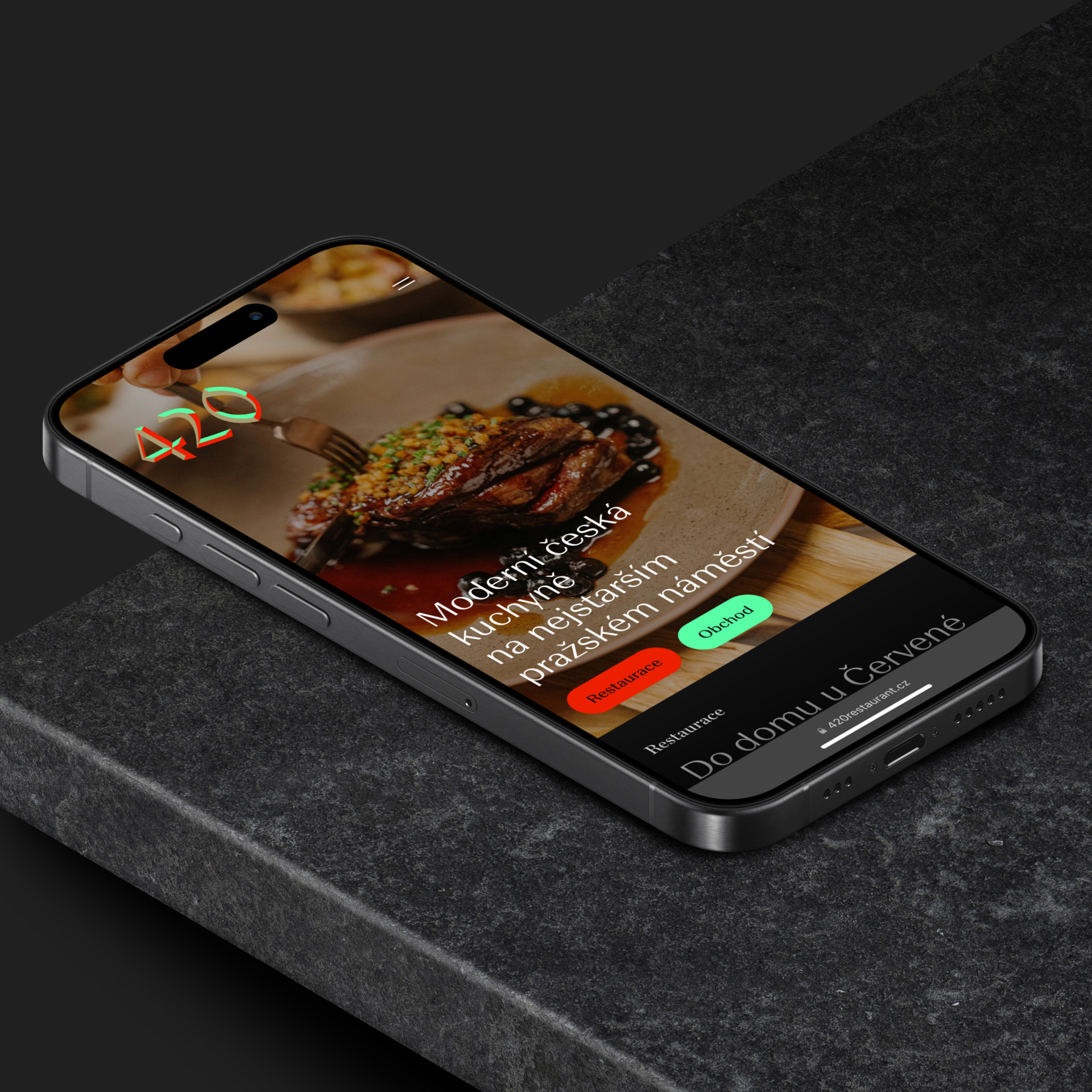
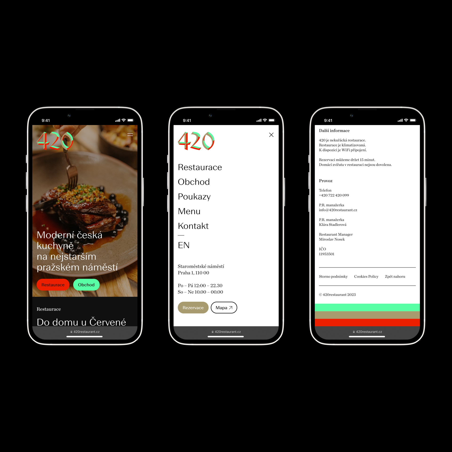
420
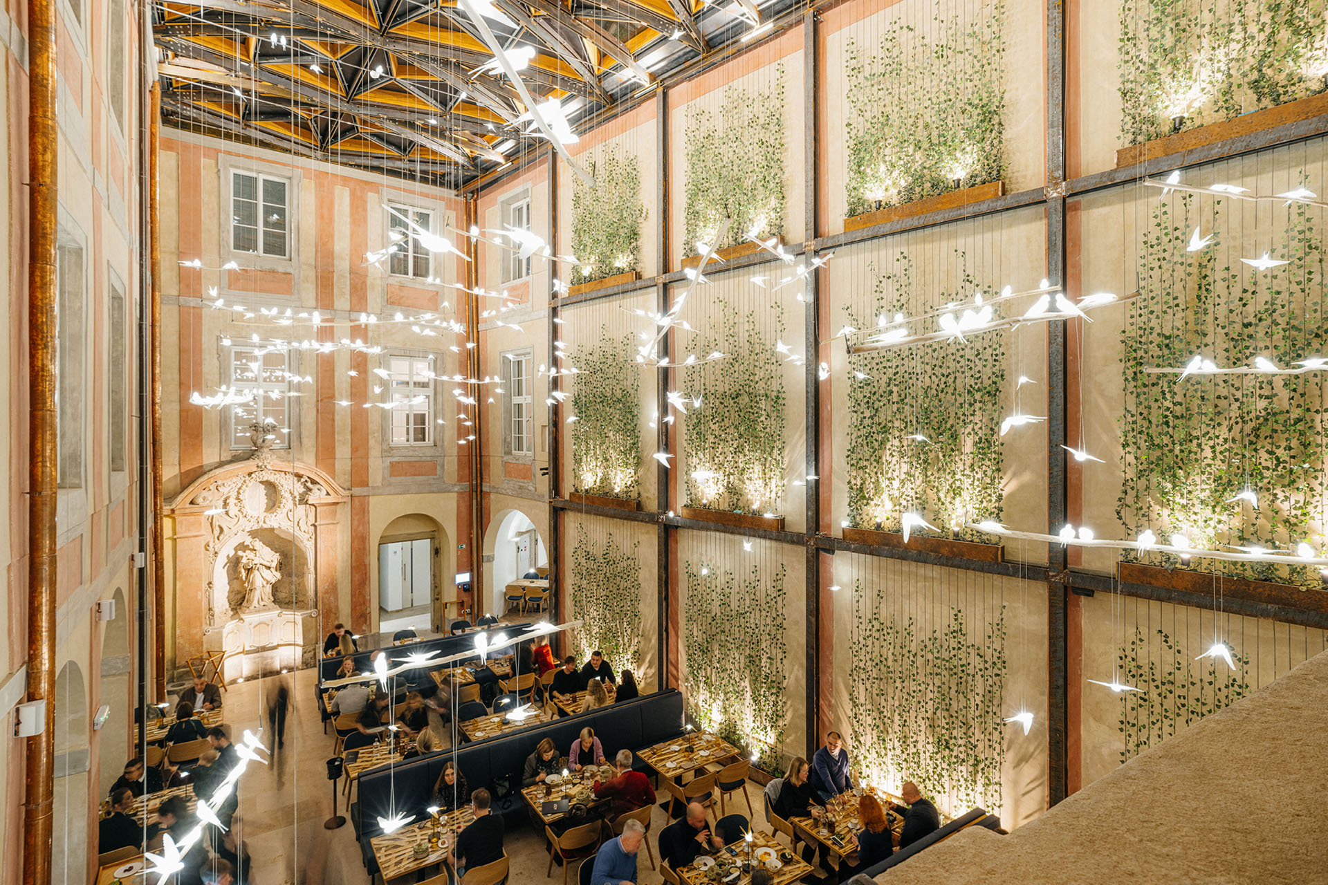
420 is not only a well-known slang term for a popular recreational activity, but also an international prefix for the Czech Republic, chosen as a humorous way to indicate to tourists and Prague residents the return of Czech cuisine to Old Town Square, where it has long been absent.
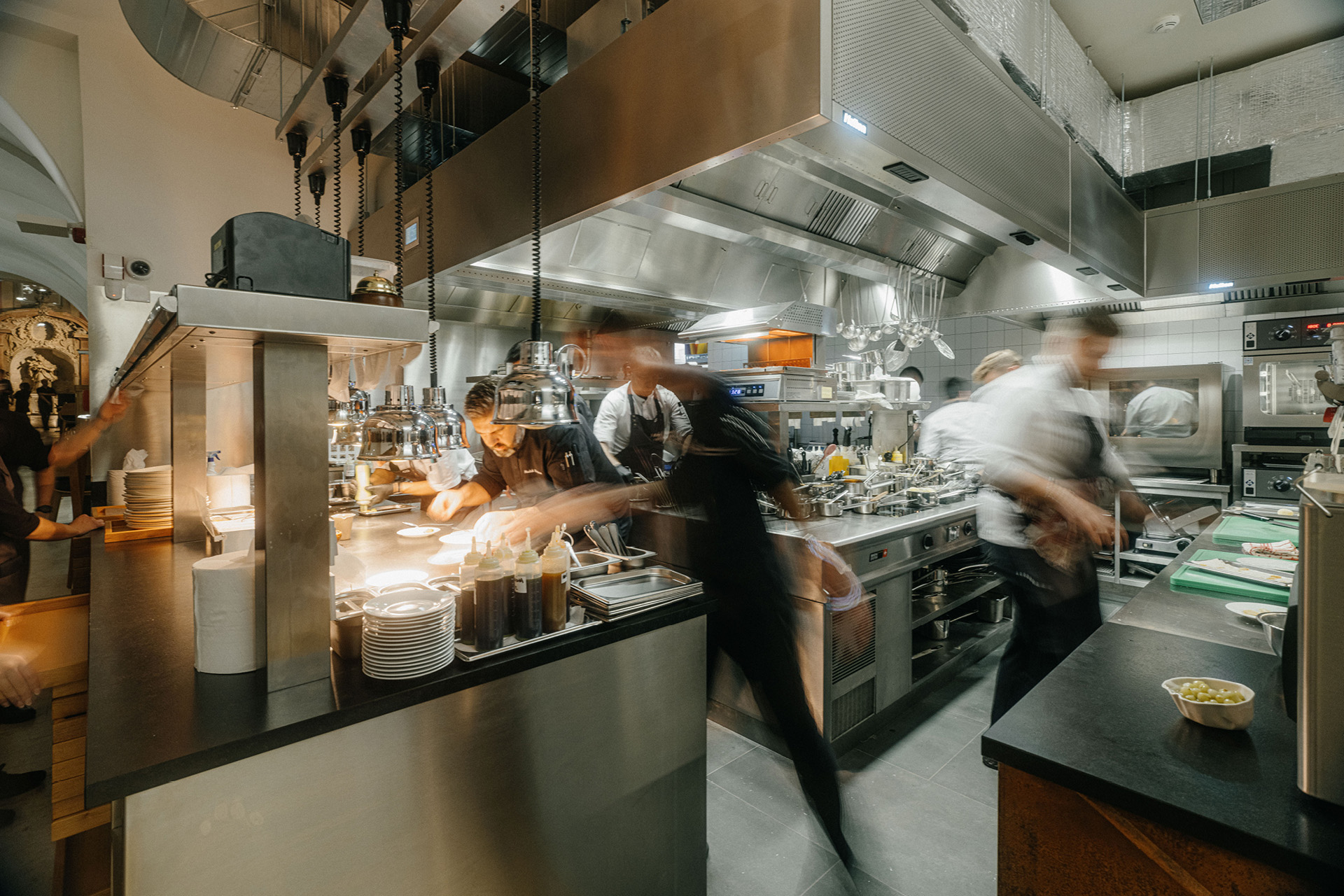
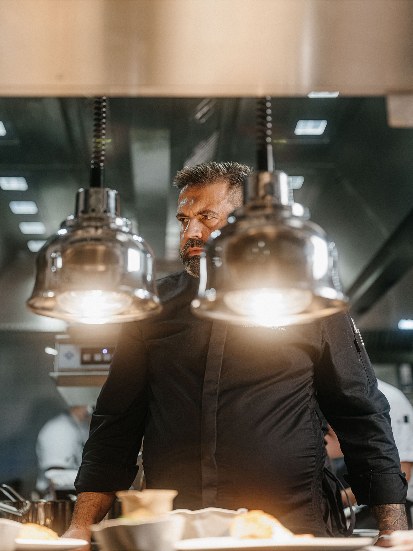
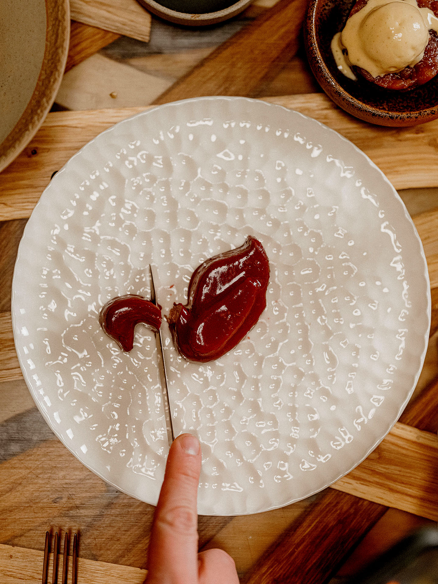
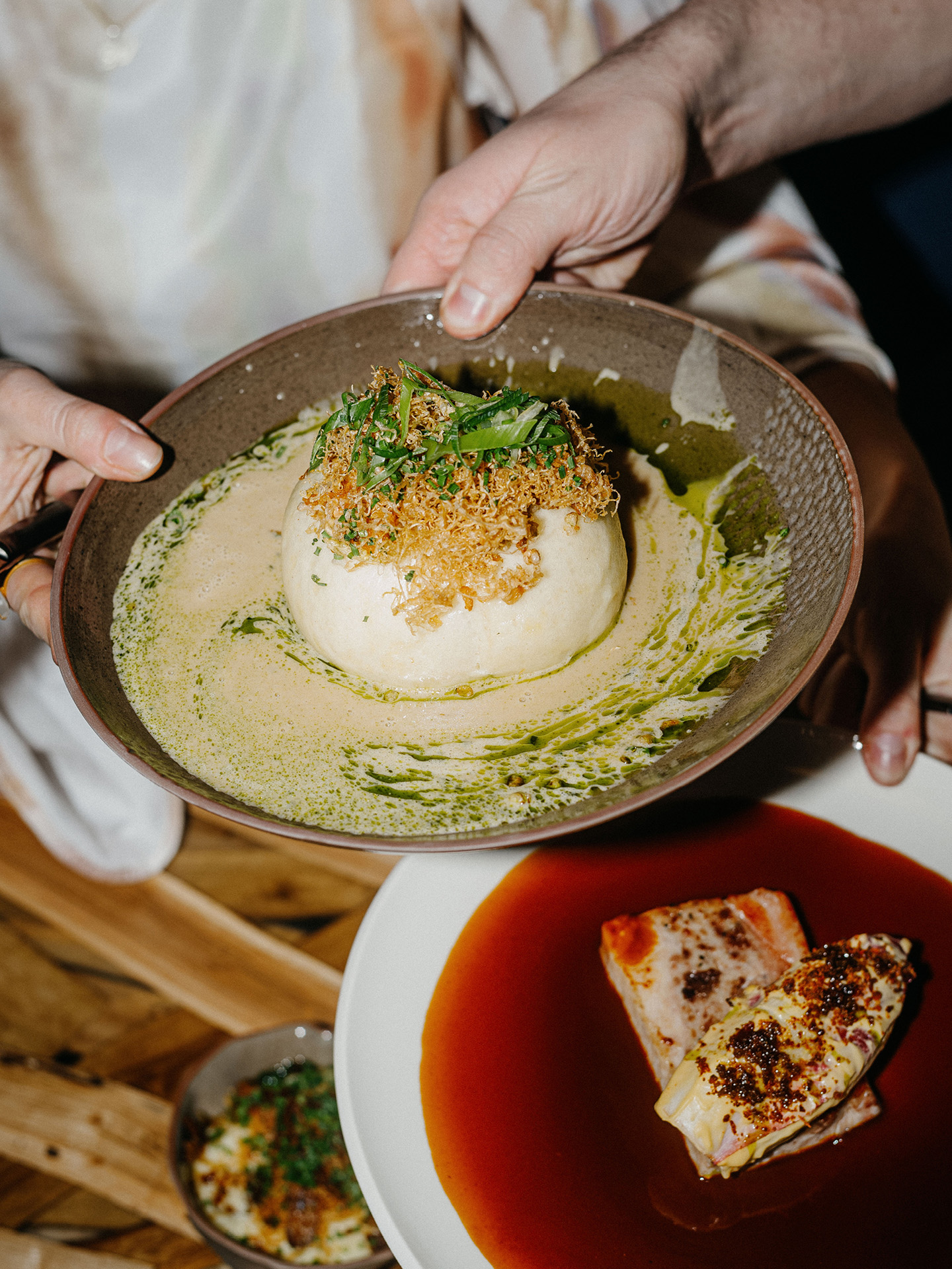
The new restaurant by Radek Kaškárek, whom we met while creating Field restaurant, is located inside the House of the Red Fox, which has seen many guises in its long history, and now provides a haven for one of the best cuisines in Prague.
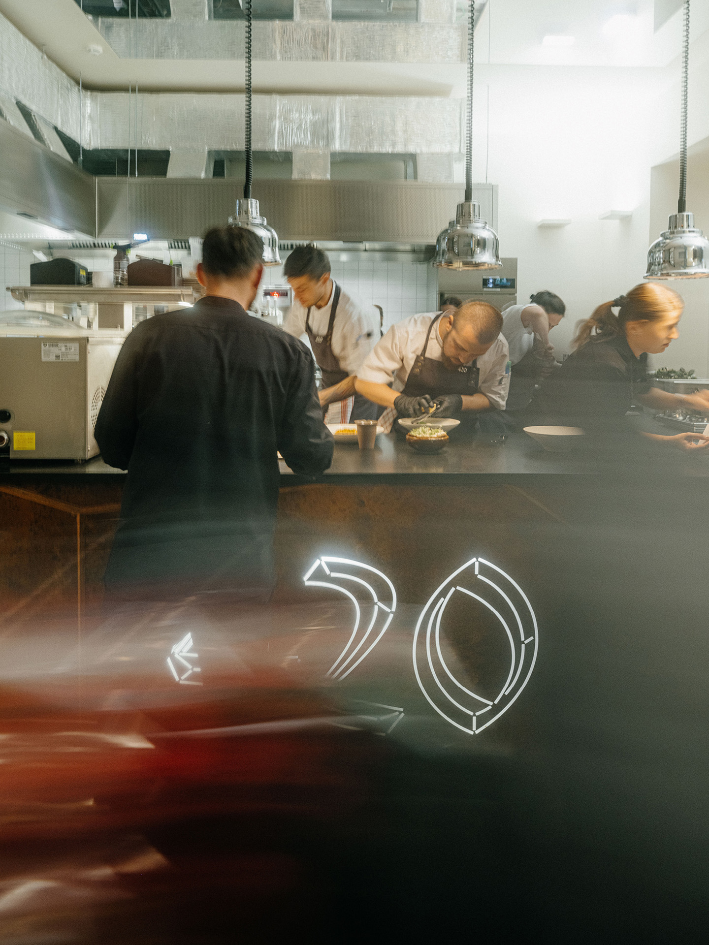
Our logotype draws inspiration from this historic venue, creating a visual system that reflects this new intention with a modern colour palette and typography.
Client: 420,
Designer: Marek Pistora, Jonatan Kuna, Michael Dolejš
Art director: Aleš Najbrt
Production: Adéla Pěchočová
Cooperation: Jakub Dohnálek (photo documentation), Jumping Jacks (creative concept), Jan Červenka (interior architecture), Karla Gondeková (illustration)
Font: Chronicle, Beausite Fit,
Type: Brand, Web, Restaurant, Packaging,
Year: 2024